Glidewell.io
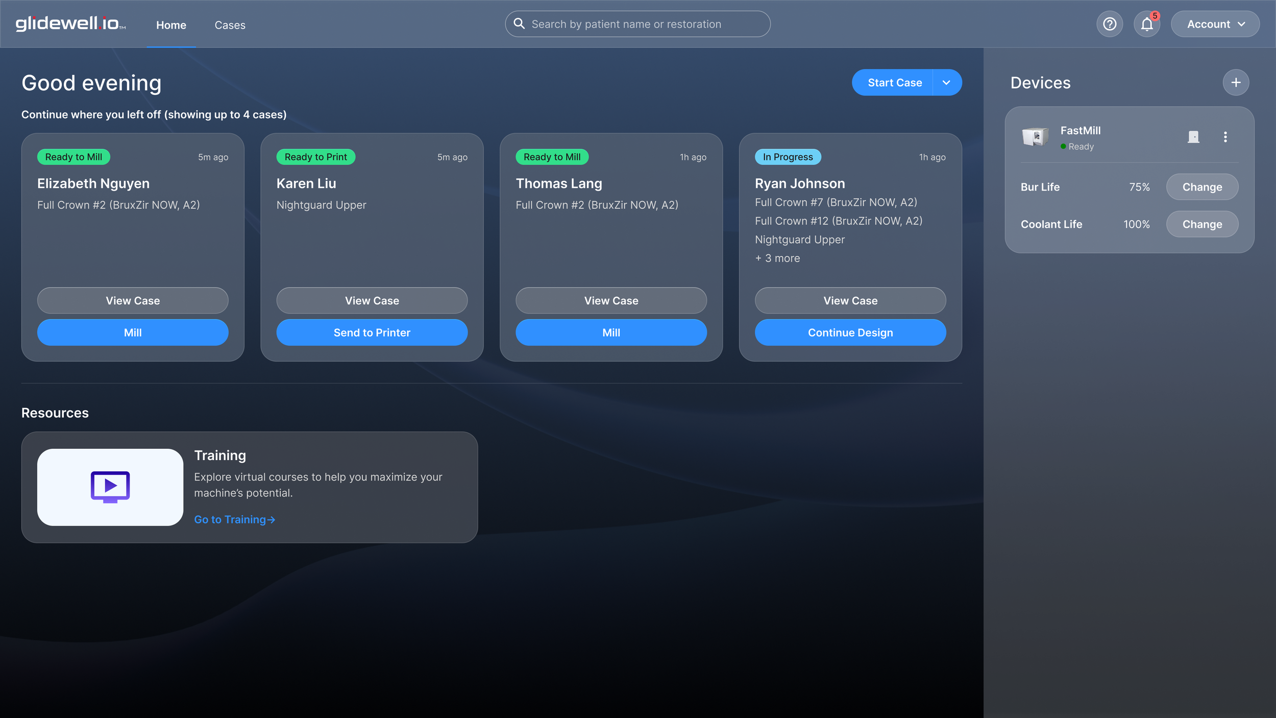
Unifying Glidewell’s 3-app suite for dentists to create dental restorations in-office into one seamless experience.
Role
Lead UX designer
Project Type
End-to-end workflow design
Contextual inquiry & usability testing
Information architecture
Team
9 designers
3 product owners
10+ software engineers
1 brand manager
Background
Dentists typically send their patients’ cases to dental labs to get the restorations of their treatments made. However, some dentists decide to adopt a digital, in-office workflow to create restorations themselves rather than relying on labs. The glidewell.io suite allows dentists to do exactly this. Currently, the suite expects dentists to navigate three separate apps to complete a single workflow: fastscan.io to scan the patient's mouth, fastdesign.io to design the restoration, and GCP to mill or 3D print it.
User Problem
Having 3 separate apps made an already steep learning curve of adopting the digital in-office workflow even steeper. Having to switch between 3 different apps, each with their own UI patterns and mental models, and remembering which app is for what process was problematic for dentists. In contextual inquiries, we heard it plainly: "I don't remember which app I'm supposed to use for what."
Our Goal
Create a seamless experience from start to finish — from creating a patient’s case to delivering a finished restoration — so that dentists can focus on treating patients rather than navigating software.
Design Challenge 1
How do we display a case list that gives users everything they need at a glance?
The three existing apps each showed case and job information differently, and reconciling them turned out to be one of the most complex problems in this project.
The data model problem:
fastscan.io and fastdesign.io both organized work around cases — one record per patient treatment. GCP, on the other hand, organized work around jobs — one record per restoration to be milled or printed. Since a single case can include multiple restorations (if a patient needs several teeth treated), this meant the same case appeared as one row in fastscan.io and fastdesign.io but as multiple rows in GCP.
The question was how to reconcile these 2 different data models into a single, coherent list.
The status problem:
All 3 apps had their own status systems. Because each app only covered one step in the process, the statuses were simple but vague — labels like "New" or "Completed" that gave no indication of which part of the process the case was in. In a unified app covering the entire lifecycle, those statuses would be meaningless on their own.
How I approached it:
I started by doing a side-by-side audit of all 3 case and job lists, identifying which columns appeared in at least 2 of the 3. That exercise helped me figure out what information was genuinely important to users across the workflow versus what was app-specific noise.
Audit of the case and job lists across 3 apps
From there, I built a lo-fi version of the unified case list. At this stage I focused on resolving the labeling inconsistencies (each app used slightly different terminology for the same things) and consolidating them into a clean set of columns. I also added action buttons — "Design" and "Mill" — directly into the list so users could move forward from any row without navigating elsewhere.
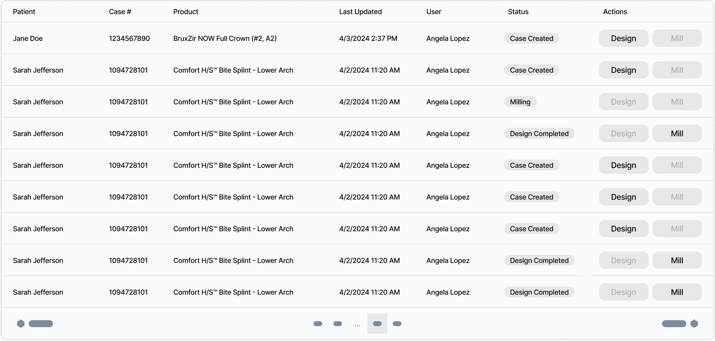
Lo-fi case list wireframe
As I iterated, I noticed the table was becoming dense. The case list has one job: let users quickly identify a case and understand its current state. Every column that didn't directly serve that job was a distraction. I removed:
Created date: redundant alongside the last modified timestamp
User: in usability testing, no participant mentioned wanting to see which staff member had touched a case
Actions column: this one required more thought. The problem was that the right action for a case changes depending on its stage: "Continue Case" if it was started but not finished, "Design" if the scan is complete, "Mill" or "Print" once the design is done. Having a button that silently relabeled itself depending on row state made the table harder to read, not easier. I removed it in favor of letting users click into a case to take action, which also aligned better with how the rest of the app worked.
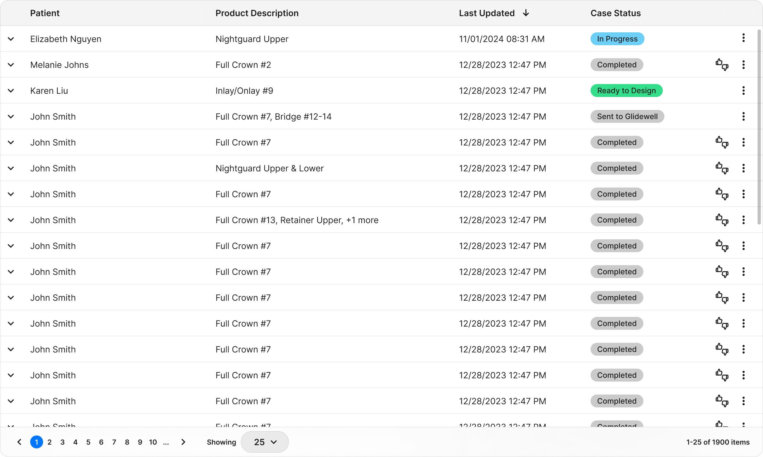
Final case list design
Solving for statuses:
I went through several rounds of iteration on the status system. The two main decisions I landed on:
First, I framed actionable statuses as "Ready for [next step]" rather than "[Previous step] Complete." The distinction matters: "Scan Complete" tells you something finished; "Ready to Design" tells you what to do next. For dentists who are moving quickly between patients, directing them forward is more useful than confirming what's already done.
Second, I had to solve for cases with multiple restorations at different stages. For example: if restoration A is currently being milled but restoration B hasn't started milling yet, what should the case-level status say? A single status couldn't accurately describe both. My solution was to show "In Progress" as the case-level status and make each row expandable, revealing a sub-list of individual restorations each with their own product-level status. This preserved the case-level status while giving users the granularity they need.
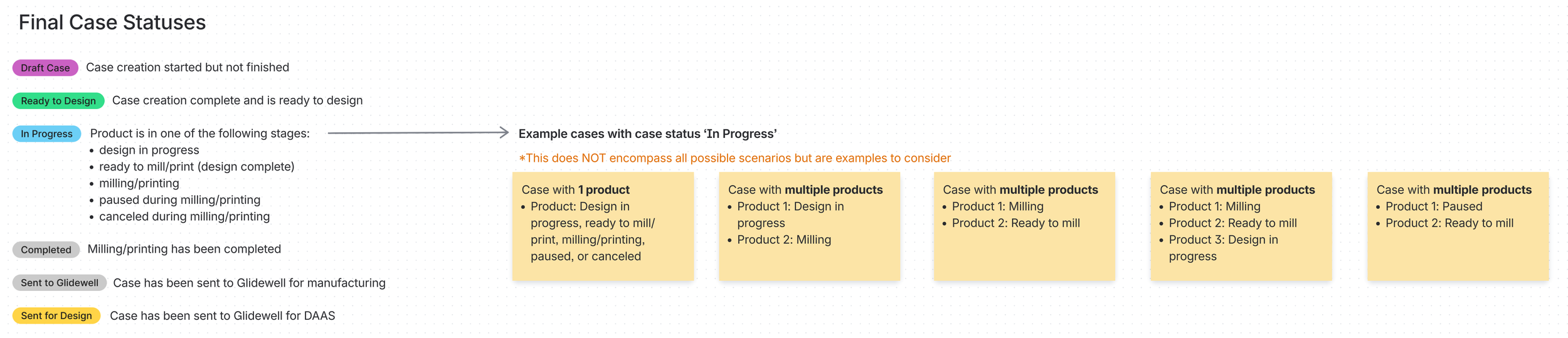
Status taxonomy
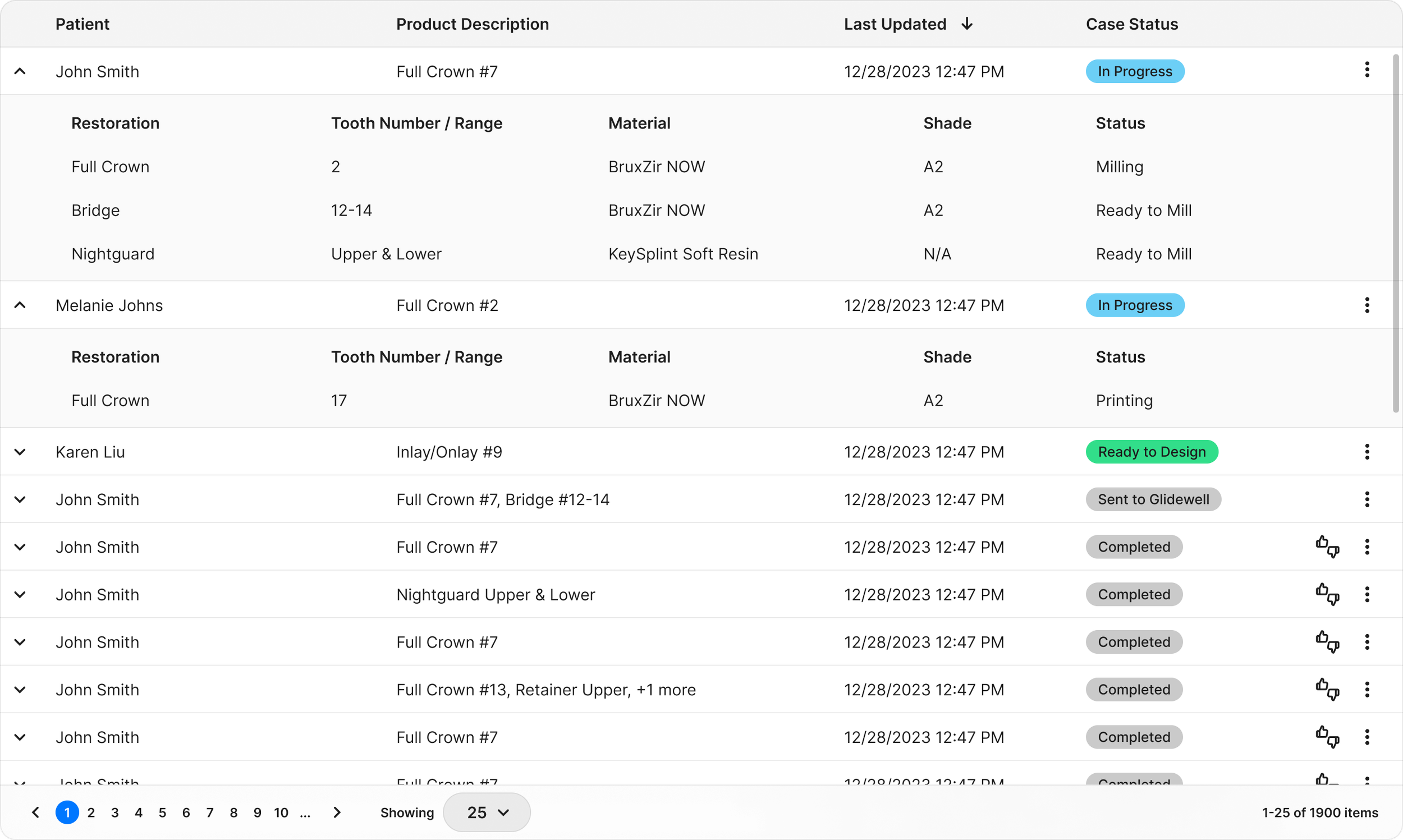
Expandable row showing restoration-level statuses
Usability testing validation
In testing with five external doctors and three dental assistants, participants were able to read the statuses aloud and correctly explain what they meant unprompted — a good signal that the labeling was doing its job. One participant noted the Cases page felt dense, which prompted me to do one more pass: I removed the case number column after confirming through research that dentists consistently refer to patients by name, not by case number.
Design Challenge 2
Connecting three processes into one flow — with flexibility built in
The second major challenge was designing the flow between scanning, designing, and milling so that users could either move through all three in one session or stop and return later without losing their place.
Accounting for different product configurations: Not all dentists own the full suite. Some only have the scanner (and send designs out to a lab for milling); others skip the scanning step because they use a third-party scanner. I designed variants of key pages to account for these configurations — surfacing only the steps and actions relevant to what a given user actually owned — while keeping the core experience consistent.
The processing time problem: When the three apps were separate, there was a natural "seam" between fastdesign.io and GCP: finishing a design meant clicking done in fastdesign, then manually opening GCP, where the file would have likely transferred over in the meantime. That transition, while clunky, had the incidental benefit of masking the file processing time.
With everything in one app, that mask disappeared. Users would now experience the processing time directly, sitting on a screen while a design file converted to a millable format. I had to decide how to handle it.
My initial approach was to have users simply wait on the processing screen, under the assumption that dentists are rarely tied to a computer and would likely step away to handle other things during this time. But after reflection, I wasn't comfortable with a design that required users to wait with no exit. We had no data yet on how long users would actually sit at their computer during processing, and forcing someone to stay on a screen for a couple of minutes — with no option to leave — felt like it could cause frustration for those who wanted to use the app for something else in the meantime.
I pivoted to allowing users to exit the processing screen and continue using the app, with the processing continuing in the background. The flexibility felt like the safer default, and it was something we planned to observe more closely after the initial launch to see how users actually behaved.
Design to milling workflow
Usability testing validation:
When participants were asked to mill a restoration, 3 out of 4 found the "Fabricate" button without guidance and none expressed confusion about the label. This confirmed that the transition from design to milling — one of the steps I was most concerned about in terms of discoverability — landed well.
What did I learn from this project?
Designing without data: when launching something new, there will be decisions that have to be made without any data to back it up. I believe the best thing to do is to make a decision based on design principles and knowledge you have about your users and then observe user behavior post-launch. Making quick pivots after a release is just as important.
Small wording decisions can carry a lot of weight. Minor copy choices can seem simple at first but can become a huge frustration for the user if written poorly. In this project, it was important for the copy to lead the user to the next action quickly and without needing to take extra seconds to think about what things mean.
Next case study